10 Must-Know Photography Composition Tips
If there is one thing that can easily make or break your photo, it’ll be composition. Composition is the soul of an image.How you position each elements within your frame has a huge impact on your work. And it’s not just that, Lighting, colour are important for composition too. Playing with composition is the most fun part about photography. Unfortunately many photographers got stuck on composition. They don’t what to do about it other than rule of third. That’s a sad thing. In this article, I’ll show you 10 composition tips that is very easy to apply. I believe with some practice you can quickly level up your composition skills and start having some real fun with photography.


Composition tip #1: Small, medium, and large
It basically means that there are elements in your photo that have the same shape, but different sizes, because they are further or close to the camera. shapes appear smaller when they are far away, and larger when they are close. If you want to add depth to your image, this is a great way to do it. We can find many things like this outside. Stairs, columns, metal frames and cobble stones. Many times, in order to show depth, people avoid long focal lengths and choose wide angle, because long focal lengths compress the scene. But with this technique, you can show a great sense of depth even with a telephoto lens. The first image was shot by a 85mm lens.


Composition tip #2: Less is more.
When we are trying to show people something, it’s very tempting to show everything. But many times the best way is to just show enough and let the viewers to imagine the rest. For example, these 2 photos are both about a girl and her motorcycle. We can either show the whole motorcycle and her, or just show enough to tell people that it’s a rider and her bike. For me, the headlight the helmet and the handle bar are enough to tell the story. Once we crop off those unnecessary details our message just become clearer. Compare these 2 images. The one on the left is a much strong one. Same idea when you’re shooting landscape. Instead of showing the thousands of hoodoos in the park. Pick a small area that best represents what it’s like when you are hiking in the park. This way, the viewers will be more focusing on the colour and shape of the hoodoo. The other benefit of this zoom in shot is it shows the ratio between the hiking trail and hoodoo. Right away your viewer will start imaging what it’ll be like if they are hiking on the trail. Remember, your photography is not about reality, It’s about what’s your reality. When you crop off unessesary details, the message you are trying to send will be much clearer.


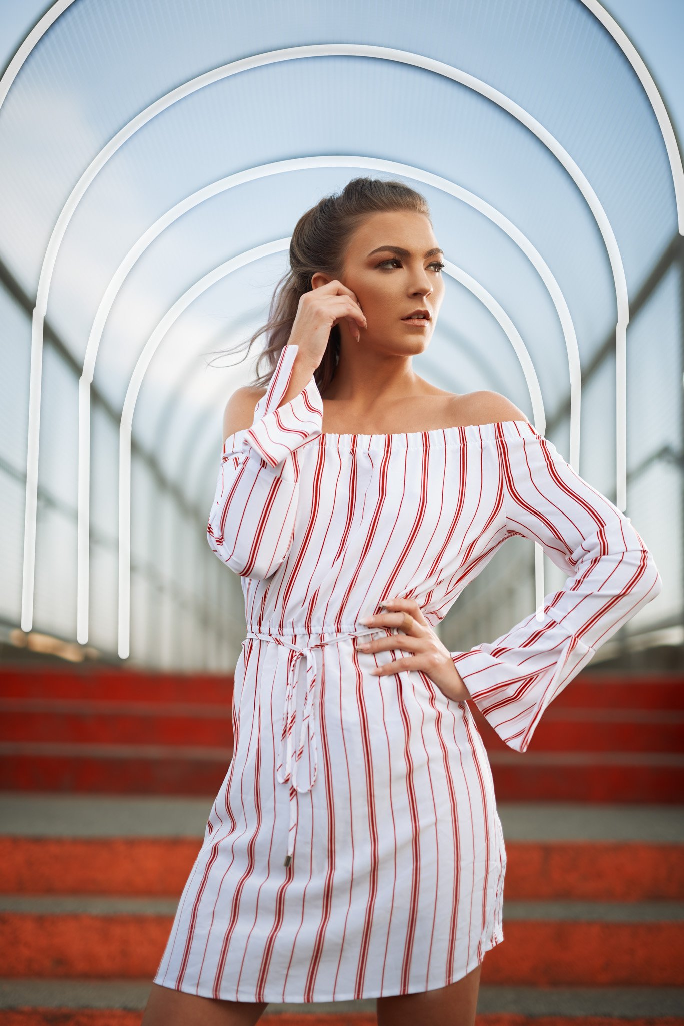
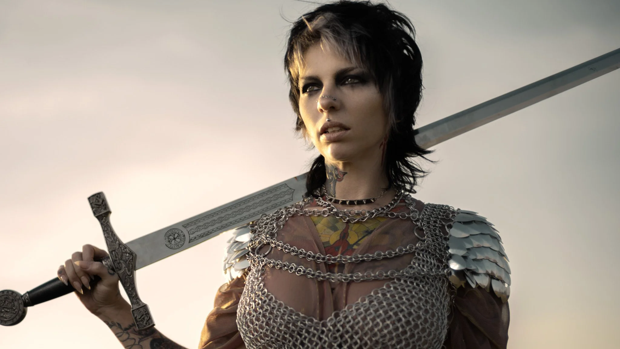
Composition tip #3 Big and small
Sometimes we want to make something look big, We might even want to exaggerate it to make it look even bigger than it actually is. Again, it’s all about our reality. Well, the best way to do that is crop in. This gives a feeling that it’s so big that it can’t even fit in the frame. Take a look at these samples. First one, she’s not wearing a super sized hat, but once cropped in, it appears so much larger. Same for the second photo, these flowers, they are simply too big to fit in the frame. In the third photo, the sword is just too long. Even a horizontal frame can’t show the whole size of it. But if I show the tip of the sword, the feeling of a long sword disappears right away.


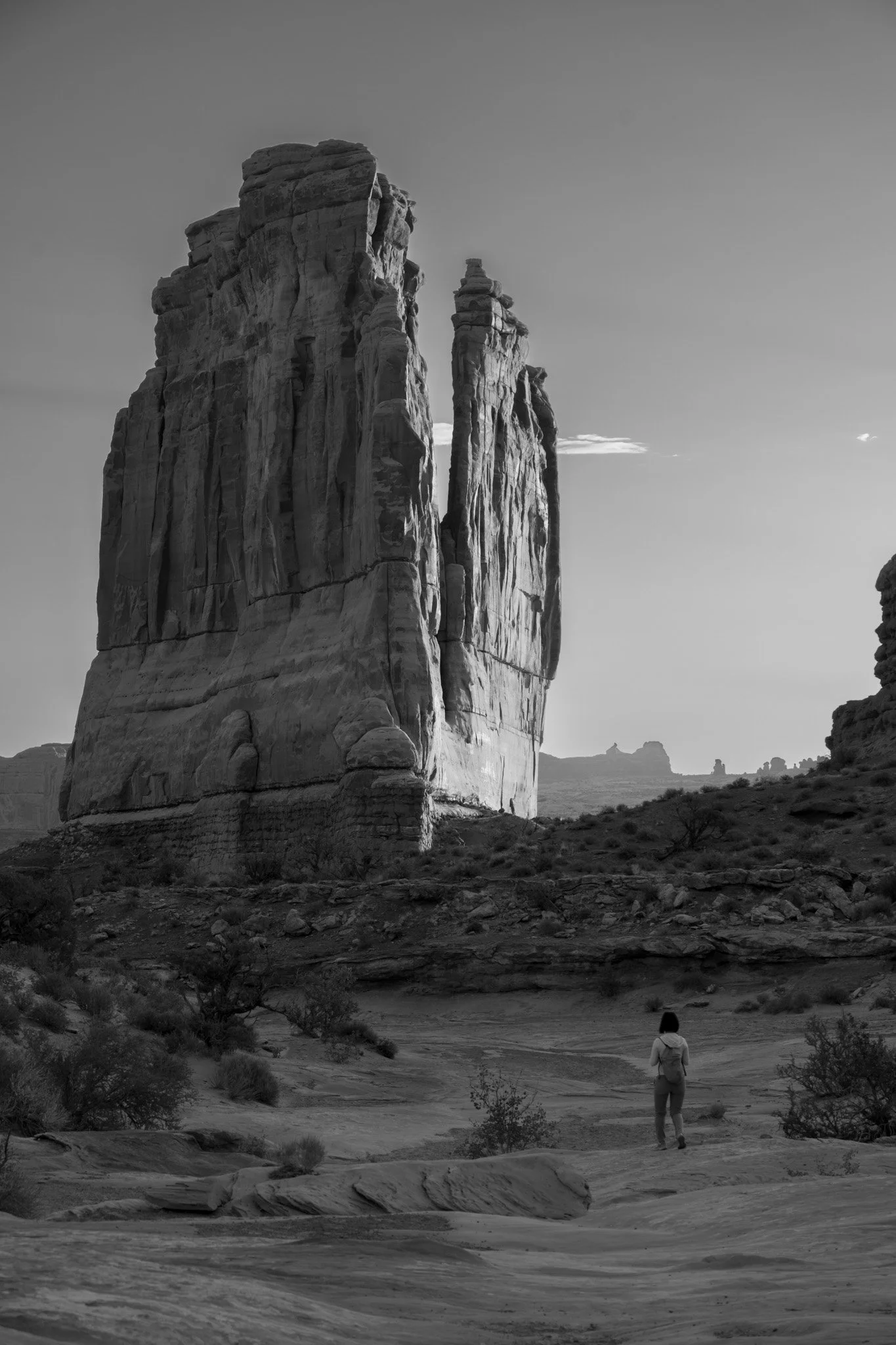
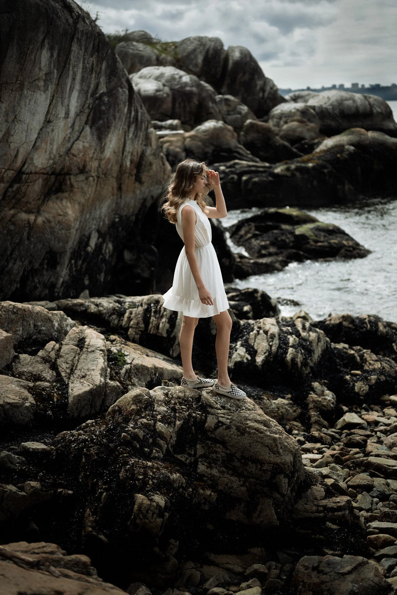
What if we want to show someone or something that is too small? Well, you put a large element beside it, or even better ,above it. In this shot, the huge rock make the person on the hiking trail look so small. Since the base of the rock is above the person, it gives a strong over powering feeling, which further enhances the effect. Ok, these rocks are huge, but we can make them look small too, by putting a big cloudy sky, above them. It’s obvious that this shot is not following the rule of third but it’s a much better composition for the the purpose. The difference in the size and position of the rock and sky send a clear message, no matter how big you are, you are too small in front of Mother Nature.

Composition tip #4 Use layers
I’m not talking about photoshop layers. I’m talking about elements in the frame that are clearly in different distances to the viewer. They are just like different layers stacked together. This is another way that helps create a sense of depth, it’s kind of like our first tip, but the difference here is they don’t have to be in the same shape, they can be completely different things. All we need to do is to make sure we compose our image to clearly show the difference in distance. In the first image, the rock she stands on is clearly the closet, and then there’s the rock on the camera left, and then the rock that is even further away. In this case, the shallow depth of field helps, because the different level of out of focus helps to create the sense of depth, but don’t over do it. If you simply just melt everything in the background then no one can tell the difference. So some level of background blur but not so much. For a full length shot like this 50mm is the longest focal length if shoot wide open. Like F1.4 or F1.8. In this image, you can see that the 3 tree branches are in 3 different layers. Foreground, middle ground and background. When you use this technique, remember you will get the best result when your main subject is located at the middle layer. You don’t need to include too much for the foreground. I’ll say no more than 25% of the image. Too much will make it too distracting and pull viewers attention away from your subject. Here are 2 examples of a subject in the middle with some in front and behind.


Composition tip #5: spacious vs confined
Sometimes we want to create a feeling of openness and vast of space, and sometimes we want to do the opposite. How can we do that using composition? To create the feeling of something being spacious and vast, leave plenty of room around your subject and make sure that there is nothing overlap in front or behind them. By giving more breathing room around subject you right away create a feeling of openness. Your subject is free to move, this will relate to a feeling that the place is vast, open and grand.


To create the feeling of something being confined, put your subject right beside something that represents obstruction. A wall is a perfect example. Not just that, your camera should be right beside it as well. This creates a POV effect. Make your viewers feel that they are right there with your subject. Immerse them into the scene, rather than have them be aware that they are looking at a photo. Because when you are so close to the wall, you can easily create this gradient of lens blur. The outer edge of the frame is the most out of focus area, and it keep getting sharper till it hits your subject. This effect is great on helping draw attention to the main subject.


Composition tip #6: Add texture
There are some many beautiful textures around us, take some time to find some and use them for your photo. They work just like a hand painted canvas background that people use in a studio. But they blend in with the surroundings much more naturally. And they are completely free. Different texture generate different emotions and feelings. wood usually has a calming effect, they make people feel cosy, and safe. Also being close to the nature. Concrete and rock gives a feeling of being stable, solid, and cold. If your models’ pose evokes feelings of softness, flexibility, and you use a warm colour, this will help create contrast. Be creative when you are selecting textures, there are many things that can be used as texture. For the 3rd example I arrange the hair of both models to make it cover more background. So the hair is working as the texture for the background. For the last one, the grass is basically the texture. Not only does it evoke the feeling of being close to nature, but by looking at the waving grass, you can almost feel the summer breeze. Remember what I said about focusing on the mood and feeling? This is a perfect example.


Composition tip #7: Add something shiny
This is a simple tick that have been used a lot in interior design and it’s quite effective. Add some shinny decorations in your room can help create more contrast make a boring room more pleasing to the eyes. We can totally use this trick on our photos. And there are lots of shinny things we can find. Like water, windows, glass or street lights. Adding something shinny will help to add more high light to the photo. This will help increase the contrast. The result is much better than adding contrast in post editing. There is one thing you need to pay attention to though, when you do this, make sure the contrast of the background and the contrast on your subject are at the same level. If you need add more contrast to the subject, you best bet is using lighting. Make sure you place your light at the position that will give you the most natural look. In other word make sure it doesn’t look flashy. If you want to learn more about that, check out my Portrait Lighting tutorial.


Composition tip #8: Horizontal and vertical
Unless you shoot 1:1 cropping ration. You have to choose your frame either horizontal or vertical. Are Horizontal orientation will expand the width the of the scene at the sacrifice of the height, a vertical image will expand the height of the scene at the sacrifice of the wide. Can we over come this limitation by using composition? Yes, there is a way. When using horizontal orientation if you also want to show the height as well, incorporate vertical lines. Even though these vertical lines get cropped off it evoke a feeling that these vertical lines extends out of the frame vertically. So it feels there are a lot more room above. If you are using a vertical orientation and also want to show the width as well, incorporate horizontal lines. The cropped horizontal lines evoke a feeling that there are a lot more space to the left or right or both. Remember the frame is only the limitation of the pixels but not the limitation of peoples feelings. The latter is always what we need to focus on.


Composition tip #9: Frame within the frame
Adding a secondary frame is powerful way to direct people’s attention. It’s like asking people to look at somewhere without saying a single word. The frame can be anything, like a door frame, car frame, arch, hands, or even imagined the frame.


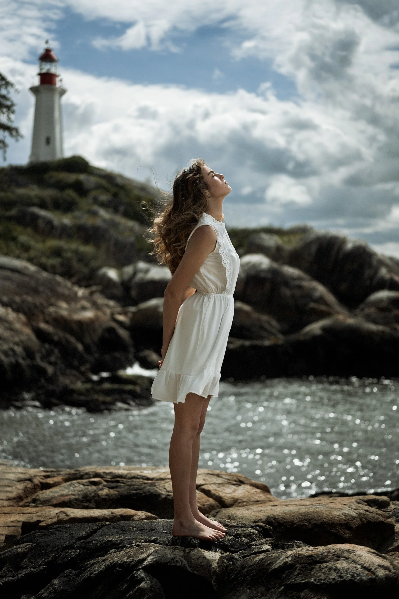
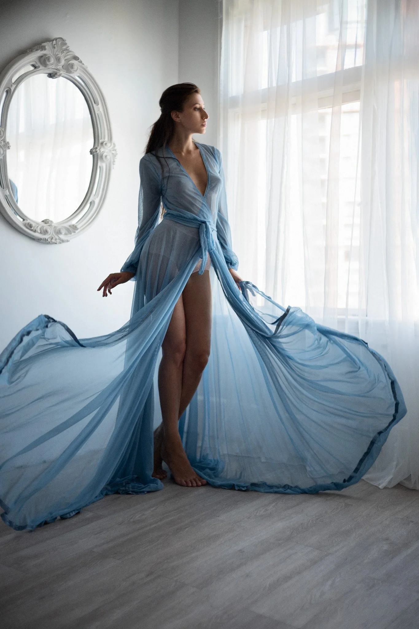
Composition tip #10: Primery and secondary subjects
Some times we might have more than one subjects in the frame, one is primary and one is secondary. When this happens we need to spend some extra effort to build a relationship between these 2 subjects, otherwise it feels like the secondary subject just happen to be there and it can be or should be removed because it’s pulling people’s attention away from it. We need to make it that the secondary subject is there for a purpose and there is some connections between the 2 subjects. Let’s take a look these 2 examples. The first, the model is sanding up straight, with the light house at the back, her pose is very similar to the light house. Her chin is up and her hair flow with the wind. Her posing evokes feeling of confident and brave. She’s braving the wind just like the light house. The second example, the curve lines from the dress matches the mirror. Inspires a soft and cozy. Mach the soft lighting and cozy interior.


conclusion:
I want to make one thing clear. These 10 composition tips are just tools, treat them like options not rules. Apply them only if you think they help to build the image or story. For the example of rule of third shouldn’t be treated as a rule. It’s just one way of doing things. Not the only way. I don’t have to remind how many great photography out there simply not following this rule. Right?
I hope you can use some of them on your future photoshoot. Remember, don’t just go there and click. Take your time observing what’s around you. I bet you can find a lot that you can use or incorporate into your shot. As long as it evoke the right mood, go ahead and use the. Composition is all about mood and feeling. And it takes a long time to master it. But hey, if this is too easy, then there is no fun.
If you love street photography check out my Havana Street Photography Workshop to Master Street Photography in a City Like No Other